Showing posts with label design. Show all posts

Tuesday, November 27, 2012

Another Tutorial, Another Blog ...Geometric Vector Shapes

So it seems that I do like doing online tutorials.  Who'd of thunk?  This one is a geometric shape tutorial that I did last week.  I tried to base it on a face that is somewhat symmetrical to make it a little easier for myself.  Can you guess who it's supposed to be?

As an aside, I post a number of tutorials and links to graphic finds on my twitter feed (@linatirilis).  If you get a chance to follow, there is a bunch of cool stuff you can check out.

Did you guess Obama? (Haha, I tried)

Saturday, November 24, 2012

A Pop of Art

I am fascinated by the pop art style that Roy Lichtenstein does.  For those who are unfamiliar with Lichtenstein's work, he was heavily influenced by comic book styles and popular advertising, and uses retro halftone effects in his works.  I wanted to get that pop art style too, so I did a tutorial that I found online.  The first two images below are a result of the tutorial, while the last image is a result of playing with a drawing tablet, masking, and the colour halftone effect (which can be found under the Filter > Pixelate tab in Photoshop).

Greta Garbo
Elizabeth Taylor
Inspired by an image I saw on Pinterest

Friday, October 26, 2012

Gradient Mesh Tool

This week I learned how to use the gradient mesh tool in Illustrator (Thanks Kai ...and online tutorials). In simple terms, a gradient is a blend of colours and a mesh is a grid that lets you construct a particular 3D shape. The photo on the right shows a simple circular object with gradient mesh points which make the object actually look like a sphere.

Below I applied the mesh tool to a few pictures I collected (one photo I found from the Internet and the other photo I took of my sister).  To do this technique I used the mesh tool and a plugin called the "mesh tormentor" (which can be found online).  Then I broke apart the image using the selection tool which produced a cool effect (at least what I think looks good).  Hope you enjoy!


Tuesday, October 9, 2012

Communicating through Design

I'm reading a book called Between Shades of Gray (this is not to be confused with the popular Fifty Shades of Grey).  This book is about a girl named Lina (you can't make this stuff up!) who is a young artist that is deported out of Lithuania, along with thousands of Lithuanians, to Siberia under Russian rule.  This girl is separated from her father in the process and as a result leaves drawings on walls during her travels in an attempt to get him to find her.

While reading this I immediately thought back in history to the time when graphic design first originated — to cave paintings and hieroglyphs.  Ancient Egyptians used cave drawings as a form to communicate just as we use graphic design to communicate today.

I feel that design has been and will continue to be primarily used as a tool for communication, not just for making things look good.  If you can't relay a message via this medium then what's the point? In university, we learned about a guy named Marshall McLuhan, who coined the term "the medium is the message".  His philosophic ideas always seemed a little deep for me, but what I think he was trying to say is that the physical medium, that poster or website you are designing, is in itself the message.  Not just what's written on the poster or site, but how the design and content ..."co-exist" (for lack of a better word).  As aspiring designers, it is our job to try to create cohesion between the message and the medium.

Graphic design has been around for ages, as it is an integral part of disseminating information.  It is up to the designer to determine how this information is going to be portrayed.  Now it is just a matter of doing it well, so that your audience can effectively understand what you are trying to say.

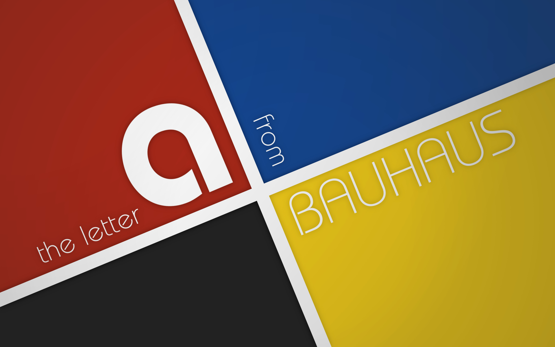
Back to Bauhaus

Recently I was reading about some design trends and a number of times the Bauhaus style kept appearing.  For those of you who aren't familiar with Bauhaus, here's the quick-and-dirty:
Bauhaus was a German school back in the early-mid 1900s that was focused on art nouveau crafts and fine arts, and was made popular based on its approach to design — namely through architecture.  It was very influential to modern design and minimalism.  The founder was Walter Gropius.
Below are a few examples of Bauhaus poster designs. 


Monday, October 8, 2012

"Type is a Beautiful Group of Letters..."

I am a firm believer that great design is based on proper use of typography.  There are so many fonts available for use out there, but how do you know that you're using the right style of font for a particular design?  As Type Designer Matthew Carter says, "Type is a beautiful group of letters, not a group of beautiful letters."  I think what he is referring to is the proper pairing of letters with design.  You shouldn't necessarily pair the most elegant font with a design, but rather the most appropriate one with it.  Although some designers say that we should throw out the rules for typography, I think there should be some basic guidelines to follow.  Here are three suggestions.  (Remember that there are always exceptions).
Source: chic-type.com via Lina on Pinterest


1.  Keep it Legible – if you need to communicate something within a poster design, for example, and you can't read the font, then what's the point of even having it there? Legibility is key.

2.  Watch your Tracking and Kerning – These terms are used to describe the spacing between letters (kerning) and spacing between groups of words (tracking).  Proper tracking and kerning can improve the readability of text.

3.  Be interesting – As a general rule, most designers tell you to try to minimize the number of typefaces you use.  However, there is an exception.  If you want to keep it interesting and are using the right fonts, I don't see why you can't use multiple fonts (such as in the poster to the left).

So there are some things to consider when playing around with typography.  Below is a typographic rubix cube I made!

Friday, October 5, 2012

Wonders of Tablet Drawing

My Inspiration
A photo I took when I was visiting New York this summer.
I recently got a drawing tablet. No, that's a lie.  I've had a tablet (Wacom Intuos 4) for awhile, I just recently started using it.  When I first began, I started tracing circles.  For those who haven't used a graphics tablet before, I must say this: drawing by hand on paper is one thing, but having the control with a tablet is another.

For starters, I could not directly look at my hand while drawing.  I had to focus on what was on my screen.  So that was tricky.  Secondly, depending on the brush I was using, the pen was quite sensitive, so sometimes thickness of the brush varied in areas where I did not want it to.  Lastly, I have a shaky hand naturally.  Getting over that was just something I had to work on.

Needless to say, I was not tracing circles like a boss.  But then, after a lot of practice (and boredom of drawing the same thing over and over) I moved on to tracing images that I found online.  This was fun!  Not portfolio worthy just yet, but I was starting to get the hang of it.


My Illustration
A work that I'm proud of (finally!) based on the photo I took.
Drawn in Photoshop CS5.
However, now that it has been a month or so, I've somewhat got a grasp on the tablet thing (as well as my steady hand).  It has taken me much practice, time and patience, as well as additional coaching from a friend (at work we have nicknamed him the "Wizard of Photoshop") but I am able to draw pictures on my own.  That's a definite bonus!


"Inspiration exists, but it has to find you working."
— Pablo Picasso